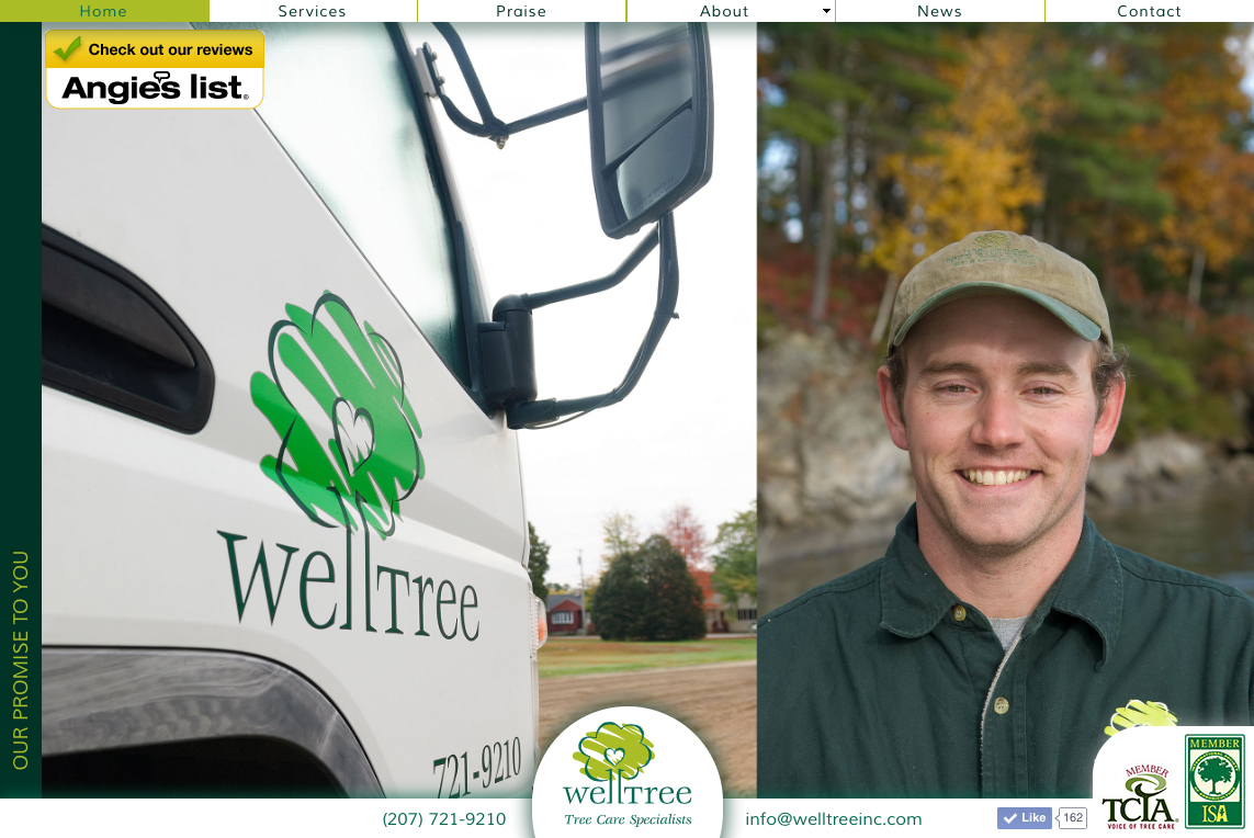
WellTree Inc.

WellTree Inc. worked closely with David Gillis Design to create a look that is at once professional, bright and full of life.

  • The WellTree logo and tagline lock-up
    The WellTree logo and tagline lock-up
  • The WellTree logo and tagline lock-up
    The WellTree logo and tagline lock-up
    The logo was designed to be both professional and approachable. The focus on tree wellness was a concious choice when naming the company as well visual branding considerations.
    Learn more...
  • The WellTree website home page
    The WellTree website home page
  • The WellTree website home page
    The WellTree website home page
    This clean, professional and approachable design is intended to reenforce their core brand values.
    Learn more...
  • Photography
    Photography
  • Photography
    Photography
    WellTree photography again strives to convey their rugged professionalism in everything they do.
    Learn more...
  • Branded Workwear
    Branded Workwear
  • Branded Workwear
    Branded Workwear
    Clearly identifying employees as WellTree staff when on client's personal or business property is of paramount importance.
    Learn more...
  • The WellTree vehicles
    The WellTree vehicles
  • The WellTree vehicles
    The WellTree vehicles
    Rugged, clean and professional, the colors and graphics help tell the story of what WellTree stands for.
    Learn more...
  • WellTree Service Letter
    WellTree Service Letter
  • WellTree Service Letter
    WellTree Service Letter
    All points of customer interaction are an opportunity to reenforce the brand - from the customer-focused legibility and approach to the use of color, each detail helps convey a sense that this company cares about its customers.
    Learn more...